Moon Light Cinema
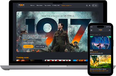
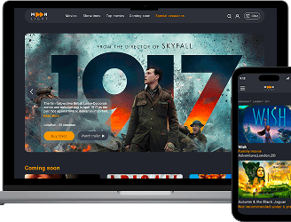
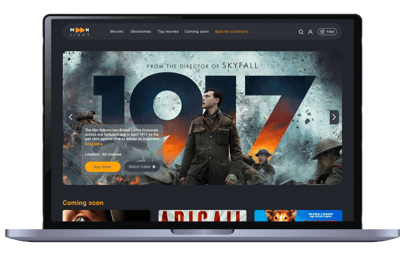
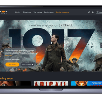
Design of a cinema website for desktop and mobile version.


About Moonlight cinema
Moonlight is a cinema based in London with multiple branches across the United Kingdom. In addition to screening films, Moonlight offers facilities such as dedicated halls for special gatherings and birthday parties. Guests can also choose films from past years to watch, not just new releases.
Persona Goal (Our Task in desktop):
Our persona wants to purchase two tickets for a movie in the Adventure genre, taking place in London, and available in the 2D format.
Chosen Movie:After browsing, the persona selects the film Autumn & the Black Jaguar.
Persona Goal (Our task in mobile):
Our persona wants to purchase one additional ticket for her friend.
Chosen Movie: She is using her mobile device &this time, because she already knows the movie's name (Autumn & the Black Jaguar), she uses the search box to quickly find the movie and proceeds to buy one ticket or she can also use the filter for find her film
Project Overview
Booking Process: We simplified the ticket purchase process by improving the online booking system, making it easier for users to find suitable films through filters and the navigation bar.
Additional Services: We highlighted services like food and beverage options, private screenings, and loyalty programs to attract and retain customers.
I was tasked with designing the client's website to boost user engagement and functionality. After conducting research, I identified which cinema features were most important to users for the booking process and incorporated those insights into the design. I took charge of the entire design process, implementing a user-friendly booking system and optimizing site navigation.
Business Goal
My Role
Target user in desktop
Users who know the name of their favourite movie and are looking to book it.
Individuals who are eager to find a movie from among various genres and do not have a specific idea yet.
The task is to design the ticket booking process for this groups.


Design Thinking
Our team of two used the Double Diamond Design framework, based on Design Thinking. The process was flexible and repeated steps, instead of following a straight line.
Competetive Analysis
Survey
Affinity
Persona
Site Map
User Flow
Sketch
Mood Board
UI-Kit
Wireframes
High Fedility Prototype
Usability Test
Discover
I used the "discover" phase to gather key insights into user needs and pain points, relying on methods like :
Competetive Analysis
Online Survey
Interview
Competetive Analysis
In the early stages, we started by examining other cinema websites with similar objectives. We performed an in-depth analysis of these platforms to better understand their overall layout and key features. From this research, we identified effective ways to structure our navigation bar, focusing on categories such as Movies, Showtimes, and Locations.
Additionally, we discovered that these features played an important role in optimizing the ticket selection process:
Trailer : Each movie includes a trailer, allowing users to better understand the film's subject and storyline
Parental Guidance: This section is crucial for families with children, as it helps them choose appropriate films
Run Time: (The film's duration), is provided to help users plan their visit accordingly.
Survey
From the results of this part of the survey, we realised that what encourages users to choose a cinema, in order, are:
1. Location of cinema
2. Screen format
3. The types of movies shown in the cinema
The most important features for choosing a movies were access to:
1. The genre
2. Movie trailers and actors
3. Seat map
4. Runtime and the schedules
We also found that users prefer categories to be organised into:
1. New release and best sellers
2. Based on show times
This survey was conducted to deepen our understanding of user preferences, needs, and challenges when purchasing cinema tickets online.
Define
Affinity Diagram
Categories: Customers prefer the ability to filter movies by:
Location(customers want to be able to find films easily using filters.)
Genre(customers want to be able to find films easily using filters.)
New releases(Customers want to see new releases featured prominently on the homepage.)
During our interview with six participants, we uncovered some valuable insights about customer needs and identified key problems, along with potential solutions:
Booking process: Customers want the following this features:
Seat Selection: A smooth and intuitive way to choose seats, with a clear overview of the cinema layout, including the distance between the screen and seats. They also want to see the seat numbers and prices clearly displayed.
Confirmation: A confirmation email that provides all the necessary details, such as the date, time, movie title, and seat number.
Purchase Duration: The entire process should take no more than 3-4 minutes, with all relevant
Choosing a film: these features are most important to customers:
Trailer & Poster: Customers want to watch a trailer to better understand the film and find details in the poster.
Parental Guidance: This is especially important for families with children, as they pay close attention to this information.
Information: Customers prefer to find a brief summary of the film along with the names of actors and the director. The information should be short, clear, and not overcrowded.


Goal:
Find Movies Easily: Ability to search for movies using various filters such as location, genre, and film format.
Clear Seat Map: Access a detailed and clear seat map to choose the most comfortable seats.
Showtimes & Seat Options: View available showtimes and seat options without hassle.
Smooth Booking Process: Experience a straightforward and reliable online ticket booking process.
Confirmation: Receive a confirmation email or message to ensure a hassle-free entry to the cinema.
Pain Point:
Confusing Interface: Previous ticketing platforms featured cluttered, confusing interfaces, making the ticket selection process frustrating.
Payment Glitches: Frequent glitches during payment caused failed transactions and disrupted the booking process.
Unclear Seat Information: Insufficient seat details led to poor seat choices, resulting in an uncomfortable viewing experience.
Hobbies
She loves discovering new restaurants, watching movies, and exploring cultural events. She and her partner, Alex, have been together for five years and enjoy spending quality time together, especially watching movies.
Age: 35
Job: Teacher
Location: London
Persona
The insights I gathered from surveys and interviews culminated in the creation of the persona. The primary objective is to highlight those patterns and pain points, which enabled me to better understand and empathise with users.
Site Map
The information architecture we developed was based on our research and the data that we collected from users.
User Flow
Develop
Challenges
Complex Navigation: Create a good and smooth navigation bar for users to easily find important information.
Solutions
Simplified and User-Friendly Navigation: We designed a Clear navigation bar that highlights key sections such as "Movies," "Showtimes," "Cinema's" and "Speciaal Occasions."
Streamlined Booking Flow.
Design a step-by-step booking process with clear progress indicators.select movie > choose showtime > pick seats > confirm payment.The necessary information for the user is clearly structured, hierarchically organised, and placed in appropriate and accessible locations.


Confusing Booking Process.
Ensuring all necessary information (movie details, parental guides, runtime, trailers) is easily accessible..


Difficult Navigation and Selection on Seat Map.
Poor visualisation of premium or special seats. Designing an intuitive seat selection process, especially for users unfamiliar with the layout of different cinema salon. Also, users with disabilities should easily find their own seats.
Intuitive Seat Map Interface.
We designed interactive seat maps with clear markers for available, reserved and premium seats, all with color-coded guides. we ensure each seat is clickable and changes color to indicate selection, making it clear which seats have been chosen.
Also, special seats for the disabled are marked.


Low Fidelity Wireframes
We initially mapped out our ideation using hand-sketched low-fidelity wireframes, aiding communication within the team during the early design stages. Later, we transitioned to creating low-fidelity wireframes on Figma to visualize page layouts and design direction. These wireframes underwent several iterations before final content development.


Mood Board
We were inspired by how cinema brings people together, creating shared experiences. Our design aims to capture the excitement of movies, encouraging users to dive into new stories and adventures. We hope to motivate visitors to explore different genres, discover new favourites, and enjoy the communal joy of watching films


Deliver
Iteration and Usability Test
Throughout the project, we went through multiple iterations, driven by the insights we gained from usability tests. These tests were instrumental in shaping our decisions and constantly enhancing our project.
In our first version, we used a filter on the homepage above our navigation bar. However, after usability testing, we realized this version confused users. They had to click more and couldn’t easily find their way.
In our new version, we’ve updated the navigation bar to include Movies, Showtimes, and Cinemas (Locations). The filter is placed under the Movies section, allowing users to view all the films available in our cinemas and use the filter for easier access.


1


2
In our first vesion,We realized that displaying videos in three small frames on the main screen reduces the impact of posters.
In our new version, we changed it to a single large frame with a trailer button and a short summary of the film. Additionally, we changed the white background color to gray, which is a neutral color, to enhance the attractiveness of the movie posters.


3
In our initial usability testing, we identified an issue with the layout on the movie information page. The movie synopsis was placed in a separate section, requiring users to scroll down to access it. To view the movie schedule, users had to scroll back to the top, and the schedule information opened at the bottom of the page.
To improve the design and reduce confusion, we moved all the movie information to the top section and introduced a 'Read More' option, allowing users to read the full content if desired. This change helped maintain consistency and coherence in the design.
Now, users can smoothly follow the steps: first, they can find all the relevant information about the film, and then they can easily choose the date and time. In the old version, they had to scroll excessively to find this information
3


4
4
After usability testing in the seat map section, we noticed that users spent more time than expected in this part. Rows A, B, C ..., were specified, but seat numbers were also needed. Additionally, a lack of sufficient information was discovered in the guide. Moreover, the screen, which was designed as a straight line, was hidden from the view of some users.
Adding seat numbers, creating a specific color for comfort and wheelchair seats, and redesigning the screen helped users pass through this stage more quickly.


5
5
5
In our previous version, we only included a photo and a brief description of our special occasions on the homepage, requiring users to click multiple times to fully understand the details.
In our new version, we've expanded the content by providing more information about the salons, our special offers, and the different services available. Additionally, we've included a video for a clearer explanation.
Usability Test Results


Before Iterations
In the initial user test, only 9.5% of participants were able to successfully complete the ticket purchase stage, while 64.9% of the clicks were incorrect.
After Iterations
After redesigning and retesting, the success rate for ticket purchases increased to 71.4%, which is approximately a 60% improvement compared to the previous result. Nearly all participants completed the task, but about 30% did not follow the intended paths. Also the rate of misclick decreased to 14.5%.


High Fidelity Wireframes
Home Page
Movies
Movies
Movies Details
Payment
Confirmation
Prototype


Our Task in desktop:
Our persona wants to purchase two tickets for a movie in the Adventure genre, taking place in London, and available in the 2D format.
After browsing, the persona selects the film Autumn & the Black Jaguar.
Our task in mobile:
Our persona wants to purchase one additional ticket for her friend.She is using her mobile device &this time, because she already knows the movie's name (Autumn & the Black Jaguar), she uses the search box to quickly find the movie and proceeds to buy one ticket.

