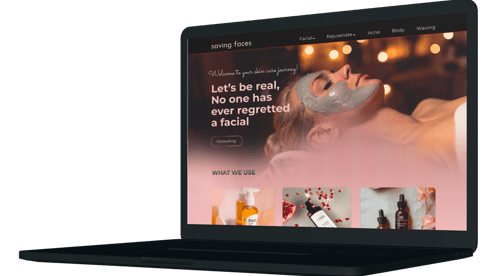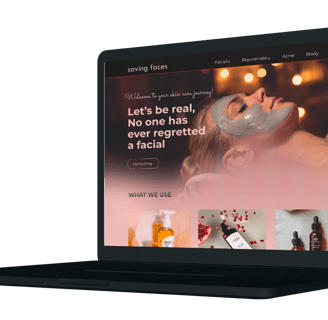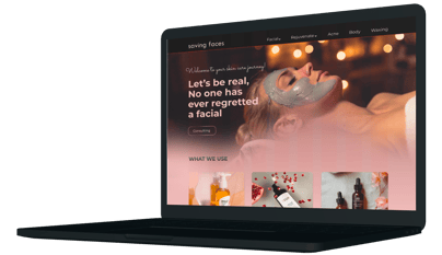
Website redesign for the facial clinic salon!
Saving Faces Skin is a skincare brand run by two friends, specializing in facial treatments, massages, and waxing services. In addition to their personalized skincare services, they offer a range of organic products for sale. The brand is dedicated to natural and holistic skincare solutions, aiming to provide clients with high-quality, organic treatments that cater to various skin needs and preferences
About Saving face


Task: Make an appointment for Acne/clear day treatment on June 26, from 10:00 to 10:30 AM.
Project Overview
Problems:
No one uses the website for book services: Users are not using the website to book services, indicating issues with the booking system's visibility or convenience.
Users stop finding services in the middle of their search: Users often abandon their search for services midway, suggesting the navigation and search functionality are not user-friendly.
I evaluated the current interface of the system and identified some existing problem:
User-Friendly Online Booking System: Implement an intuitive and reliable online booking platform that enables clients to schedule appointments effortlessly.
Organized Service Categories: Clearly categorize services to help users quickly identify and select the treatments they need.
Reduce Phone Calls: Minimize the need for phone calls by encouraging online bookings and providing clear instructions on how to book.
Goals:
My Role:
I was tasked with redesigning the client's website to boost user engagement and functionality. After evaluating the existing site, I identified issues with the booking system, navigation. I took charge of the entire design process, implementing a user-friendly booking system, improving site navigation. The redesign resulted in increased online bookings and enhanced customer satisfaction, effectively meeting the client's & business goals.
Redesign process
Heuristic Evaluation
Survey
Competetive Analysis
Affinity
Persona
Site Map
User Flow
Sketch
Mood Board
Wireframe
UI-Kit
Usability Test
Final Wire Frames
High-fi prototypes
Our team of two followed the Double Diamond Design framework, rooted in the Design Thinking methodology. The process was iterative rather than linear, as we revisited and refined each stage throughout the project.
Discover
Heuristic Evaluation
Heuristic evaluation is the process in which a team analyzes a website from the point of view of usability, including navigation, clarity of information, consistency, and error prevention. Using these findings, we improved the browsing experience and made it more user-friendly.
To understand the users' pain points and develop effective solutions, we employed a comprehensive research approach that consisted of the following methods:
Heuristic Evaluation
Online Survey
Competitive Analysis
Sevice categorization:
By understanding customer preferences, we can identify the most popular treatments and name our service categories effectively. Our top services include:
Facials: Skin treatments for cleansing and nourishment.
Rejuvenation: Anti-aging treatments for revitalizing skin.
Acne Solutions: Treatments to manage and reduce acne.
Waxing: Hair removal for smooth skin.
These categories make it easy for clients to find the services they need.
At first, we started with a survey to get a general idea of people's needs and challenges in the choose the skincare service & booking service.
Survey
Takeaways:
After reviewing other websites, we have decided to focus on the following options:
Highlight Our Specialists:Provide information about the expertise and experience of our specialists.
Clear Pricing and Service Duration:Display transparent pricing and the duration for each service.
Detailed Service Descriptions:Offer comprehensive details about each service we provide.
Smooth Categorization:Organize services into clear and easy-to-navigate categories.
Competitive Analysis
Analyzing our competitors helped us decide what should be on the homepage. It provided insights into the features, functions, and flows. As a result, we were able to identify opportunities for creating a product that would differentiate itself from the competition.
Define
Affinity
We have interviewed 6 people to get insight through the project. The interview results have been organized into an affinity diagram to know the user's challenges and needs and consider them during the design.
Takeaways:
Photos and Information About Services: High-quality images and detailed descriptions of each service.
Clear Pricing and Service Duration: Transparent pricing and the time required for each service.
Popular Services: Focus on the most popular treatments: Acne, Rejuvenation, and Waxing.
Consultation and Easy Booking: Easy access to free consultations and a straightforward booking process.
Based on our UX research, we focused on simplifying user needs and pain points. We took into account that the business offers skincare products, uses organic products in the salon, and needs an easy booking process. This helped us match project goals with what users expect and set the groundwork for the design phase.
Persona
The persona has been defined based on user research.
Site Map
Here you can see the website's information architecture summarized in the site map.
To ensure our information architecture met user expectations, we developed an initial version and refined it iteratively based on user testing . After conducting a usability test, we changed our categories to better meet user needs.our first categories were (Face, Body, and Waxing), but we improved them to (Facial, Rejuvenate, Acne, Waxing, and Body). This adjustment led to better results in subsequent usability tests.
User Flow
We have worked through the task of booking a service that here you can see the user flow of this task.
Develop
Challenges & Solutions
Challenge:
The biggest challenge for us was organizing the salon services into categories so that users could easily find the information they need quickly.
Solution:
Based on our research and usability test results, we identified which services were in higher demand. We then refined the categories to ensure that users could easily find the services they need on the website.
Challenge:
The website lacked a booking process, requiring users to call the salon to make an appointment. This was a need for both users, who wanted a more convenient booking option, and the business, which needed to streamline the appointment process.
Solution:
Users can follow the booking process on the website, view photos, prices, and durations of services, and complete their booking all online.
We tried to sketch our ideas in order to brainstorm and communicate better. Here you can see a few sketches.
Sketches & low fidelity wire frames
Mood Board
The color palette we created was inspired by our moodboard. Green and Pink are the most dominant colors in the design because the product we used is organic. The moodboard draws inspiration from nature and organic products, as well as the service of skin protection.
Mid Fidelity Wireframes
Our goal in creating the initial wireframes was to conduct user testing to evaluate their ability to navigate the categories and find the desired services easily & smooth booking online process Throughout the process, we made several changes to improve user performance and experience.
UI-Kit
We developed a design system to ensure consistency across all pages of our product, including typefaces, colors, assets, CTA and grids. The simplicity of the design is achieved through the use of ample white space, and a minimalistic approach.
Deliver
Iterations
Throughout the project, we made several changes based on insights from usability tests on mid- fidelity wireframes. These tests played a key role in guiding our decisions and continually improving the project.
We had "Face," "Body," and "Waxing" as the main categories, with subcategories placed under these. However, users found it difficult to navigate through multiple pages to find their desired service, and the booking process was not user-friendly.
Users can now view the price, duration, and description of each service, and then continue with the booking process.
Based on usability testing, we merged the frame of day and time selection with the frame of customer information. This combination streamlined the booking process, making it more convenient for users.
we updated the navigation bar to include five main categories: "Facial," "Rejuvenate," "Acne," "Body," and "Waxing." By dividing the "Face" category into "Facial," "Rejuvenate," and "Acne," we've reduced the number of clicks required. This change makes it easier for users to find the services they need and streamlines the booking process.
Landing Page
Services
In the last version, we first provided a photo and a brief explanation of treatment.
they could then choose between the services and proceed with the booking process.
Usability Test
Before:
During mid-fidelity wireframe testing, only 23% of users successfully booked their desired service, with most struggling to navigate categories and subcategories. We responded by revising our information architecture to simplify navigation and conducted further tests to ensure it was easier for users to find and book services.
After :
revising the information architecture and redesigning the categories and subcategories, we addressed the issue of misclicks and improved the booking navigation. As a result, 91.7% of users were able to easily find their desired service and complete the reservation process.
High Fidelity Wireframes
Here you can see the final wireframes and prototype.
Landing Page
Cleansing
Peeling
Massage
Hydrating
Oxygen
Acne
Collagen
Lifting
Make an appointment
Confirmation


