Virtutec Desktop Apps
The company previously had four separate desktop apps for their products, and as part of the redesign, I have merged them into a single desktop app.
About Virtutec
Virtutec offers a comprehensive suite of software solutions to streamline various business processes. Their desktop app includes three core products, as well as an additional app dedicated to Virtutec itself
SalCon - This software is focused on sales and marketing. It enables users to present products realistically and interactively through virtual tours or 3D configurations. This helps both sales teams and customers visualize complex products, making the sales process faster and more transparent
ProCon - Designed for the production and assembly process, ProCon assists workers by guiding them step-by-step through tasks. It helps overcome labor shortages by providing a user-friendly interface, which reduces training time and enhances efficiency, even with foreign workers
SerCon - This after-sales software empowers customers, dealers, and service technicians to resolve issues independently. By providing access to up-to-date manuals, part catalogs, and 3D visualizations, it ensures quick, accurate service without overwhelming the service department.
Together, these tools help businesses streamline their operations across sales, production, and after-sales services, enabling improved efficiency and better customer experiences.
Project Overview
My Role:
As a UX/UI designer at Virtutec, I was tasked with redesigning the client's platforms to enhance user engagement and functionality. After evaluating the existing platforms and speaking with customers, I identified navigation issues. I led the entire design process, implementing a user-friendly system and improving site navigation.
Problems:
Virtutec has three software products, each with its own platform, along with an additional platform for Virtutec itself. This setup caused confusion for users, who had to switch between the four platforms. Another issue was the navigation, where there were many titles that could be merged, as they were related and could be grouped under broader categories.
Goals:
Platform Consolidation: Merge the four platforms into a single unified platform. This would eliminate the need for users to switch between multiple platforms, streamlining the user experience and reducing confusion.
Simplified Navigation: Redesign the navigation to group related titles under broader categories. By consolidating similar titles, you can create a more intuitive structure that helps users find what they need more quickly and easily.
By consolidating the platforms and improving the navigation structure, Virtutec can create a more seamless, user-friendly experience that minimizes confusion and enhances overall usability.
Redesign Process
Discover
Define
Develop
Deliver
Heuristic Evaluation
Interview
Persona
Site Map
Sketch
Wireframes
Usability Test
Final Wire Frames
High-fi prototypes
Discover
To understand the users' pain points and develop effective solutions, we employed a comprehensive research approach that consisted of the following methods:
Heuristic Evaluation
Interview
Heuristic Evaluation
In this step, I reviewed all four platforms to identify which parts needed changes and which data was unnecessary from a usability perspective, including navigation, clarity of information, consistency, and error prevention. Using these findings, I improved the browsing experience and made it more user-friendly.
The dashboard is empty and doesn't have information.
1
2
Titles: "Company," "User," and "Roles" are closely related and don’t need separate titles. We can group all this information under a single title, allowing users to find all company-related data in one place.
2
3
Titles : "Voucher," "Payment," and "Deliveries" all relate to financial information. We can combine them under a single "Finance" title, so users can find all finance-related information in one place.
3
Virtutec Platform
1
Models and Category contain similar information and should be accessible together, allowing users to find related data in a single, unified section. Currently, they are separated into two parts, requiring additional clicks to access information in different places. Combining these under one section would simplify navigation and make it easier for users to find relevant data.
1
1
1
1
2
Based on filtering, properties, and variables, all three items provide users with the option to filter
2
3
We have models on the Virtutec platform, and users need to first upload their models there(Virtutec Platform). Then, they have to come back to the Salcon platform to use them. This process can be confusing for users as they have to switch between different platforms to upload and use the models of their product
3
Salcon Platform
The dashboard is empty and doesn't have information.
and create a question list when they want to use the platform. This is because our users want to send 3D models to each of their customers with different options. As a result, their customers need to answer different filters for each case. However, these filters are listed under different titles, and the user has to return to the Salcon home page platform to set each filter again.
Procon Platform
The dashboard is empty and doesn't have information.
The Progress is empty and doesn't have information.
We have models on the Virtutec platform, and users need to first upload their models there(Virtutec Platform). Then, they have to come back to the Procon platform to use them. This process can be confusing for users as they have to switch between different platforms to upload and use the models of their product
1
1
2
2
3
3
Sercon Platform
The dashboard is empty and doesn't have information.
We have models on the Virtutec platform, and users need to first upload their models there(Virtutec Platform). Then, they have to come back to the Sercon platform to use them. This process can be confusing for users as they have to switch between different platforms to upload and use the models of their product
We have companies listed on the Virtutec platform, and users can access data about these companies there as well. This creates repetition.
Indeed, from this title, users can create a new quote on the platform, so it can be included under the configuration titles.
3
3
2
2
1
1
4
4
Interview
In this phase, we began with key questions and conducted interviews to understand users' pain points, challenges, and needs regarding our product. This approach allowed us to gather suitable data to inform our improvements
1) What challenges do you face when using our platforms?
From this question, we understand the following key points:
Platform Confusion: Many users find it confusing to switch between multiple platforms, highlighting the need for a unified experience.
Difficulty Finding Information: Users struggle to locate information or tools quickly, suggesting that a more streamlined structure could improve accessibility.
Navigation Issues: The current navigation includes too many similar options, creating confusion and indicating a need for clearer, consolidated categories.
Dashboard: Provides users with an overview of their activities and key information. It offers a summary of actions performed and allows access to relevant reports for better insights.
2) Which items would you like to have included in a single platform?
From this question, we understand the following key points:
Activity Summary: Display a summary of recent activities directly on the dashboard for quick reference and improved efficiency.
Configuration Access: Include a dedicated button for configuration, as well as pre-configuration options to access the 3D area seamlessly.
Project Information: Provide quick access to relevant project details, especially for ProCon, to keep everything centralized.
Task Management: Add task management titel to eliminate the need to switch to Jira or CRM for checking recent activities or updates.
Define
Persona
I developed this persona as a result of my research. I gathered insights into user preferences and pain points, and face-to-face interviews allowed me to explore their challenges and needs in greater depth. This comprehensive approach provided a clear understanding of our target audience, enabling me to create a persona that accurately reflects their goals, expectations, and challenges.
Site Map
For this project, the site map was designed to simplify navigation and group related features under broader categories. By consolidating similar sections and eliminating redundancy, the new structure enhances accessibility and usability.
Develop
Sketches &low fidelity wire frames
I initially mapped out our ideation using hand-sketched low-fidelity wireframes, aiding communication within the team during the early design stages. Later, I transitioned to creating low-fidelity wireframes on Figma to visualize page layouts and design direction. These wireframes underwent several iterations before final content development.
Deliver
Iterations
Throughout the project, we implemented several changes based on insights gathered from usability tests conducted on mid-fidelity wireframes. These tests were instrumental in guiding our decisions and driving continuous improvements to the project.
As you can see, I created four distinct titles—General Menu, SalCon, SerCon, and ProCon—to ensure smoother navigation. This structure allows users to easily locate their data within the corresponding subtitles, enhancing their overall experience.
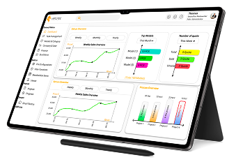
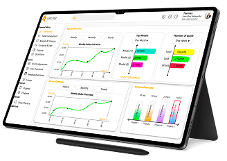
The dashboard for all our products was empty. We need to select data for the dashboard that represents all our products and activities.
The dashboard is divided into three sections for SalCon, SerCon, and ProCon.
SalCon: Users can view sales reports (weekly, monthly, yearly) and see detailed information about top models and quotes.
SerCon: Includes sales reports (weekly, monthly, yearly).
ProCon: Displays the status of ongoing projects, providing updates and insights.
We do not have task management features in any of our software.
In the new design, we have introduced a Task Management section. Here, users can find all their activities, including:
A summary of each activity with detailed information.
Attached files and comments.
Information about who is responsible for the task.
An option to send tasks via email.
In the old models, users had to first upload their products in Virtutec, then switch to another software to view and use them in the 3D platform. While our other software also supported models, users could only view the products there—they couldn’t upload or edit them.
Another issue was related to categories and models being placed under two different titles, even though they used similar data. This separation caused unnecessary complexity, as the data didn’t require distinct titles.
In the new design, we consolidated Models and Category under a single title in the general menu. Users can now access all data related to categories and models in one area.
Additionally, they can upload, edit, and view their products directly within this section, eliminating the need to switch between software platforms and reducing confusion.
In the old models, users had to first upload their products in Virtutec, then switch to another software to view and use them in the 3D platform. While our other software also supported models, users could only view the products there—they couldn’t upload or edit them.
Another issue was related to categories and models being placed under two different titles, even though they used similar data. This separation caused unnecessary complexity, as the data didn’t require distinct titles.
In the new design, we combined Company & User under one title and merged their data along with roles into a single section. All related information can now be found in one place.
This section now displays: Company names, User names, User emails, User roles.
For editing, users can utilize the tabs above to make changes.
This streamlined approach makes it easier to manage and access all relevant data without switching between sections.
In the old design, we had Delivery Terms, Payment Terms, and Vouchers, which provided financial-related data. However, these were placed under different titles, making it harder to access and manage the information.
In the new design, we created a Finance title. Under this title, there are two subcategories:
Conditions: Users can find data related to Payment Terms and Delivery Terms here.
Vouchers: This section is dedicated to managing voucher-related information.
This consolidation makes it easier for users to access all financial-related data in one place.
In the SalCon software, we made the following changes:
Models are now included in the general menu
We changed the Suggested Items section to Merchandise Items and added additional important information, such as number of items and price in this part.
We implemented a Filter function, which combines questions based on the filter and properties, as they all relate to filtering options.
The rest of the data remains similar to the previous design.
These adjustments aim to improve navigation and provide more relevant product details in one place.
In the ProCon software, we made the following updates:
Models are now included in the general menu, making them easier to access.
The Project section remains the same as before.
We introduced a Progress feature, which was empty in the old design. Now, it shows relevant data about project advancement. We added an Activity State to provide detailed information about each project & Timeline has been added, showing deadlines for each project, giving users a clearer overview of project timelines and progress.
These changes aim to provide better tracking and visibility of project status.
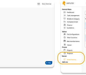
In the SerCon software, we made the following updates:
Models and Company are now included in the general menu for easier access.
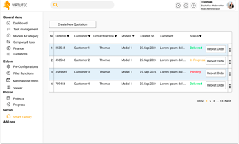
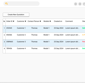
We introduced the title Smart Factory, under which users can find and track information about the delivery status of their customer orders. they can also repeat their order.
These improvements help users to efficiently follow up on order statuses and ensure better management of customer deliveries.

Usability Test
I conducted a usability test of the product with our customers, who had used our products before. We performed the test during a meeting. In the first round, with the first group, they couldn't complete a few tasks. They also shared some initial ideas, such as merging certain data and creating separate sections for specific information. For the second round, I used a different group and addressed all the feedback from the first group. The results of the second test were positive, and the participants successfully completed the tasks I assigned to them. They also provided additional comments on the design, which we took into account and implemented.
I also created a self-onboarding process for new users on our platform. This way, they can easily understand how to upload their products and navigate the platform.
Below, you can find the steps that a new user must follow (Lara is our new persona as a new customer.)
High Fidelity wireframes
General Menu
Here you can see the final wireframes and prototype.
Dashboard
Task Management
Models & Categories
Company & User
Finance
Quotations
Salcon (Sales Software)
Pre-Configurations
Filter Function
Merchandise Items
Viewer
Procon (Production Software)
Project
Progress
Sercon (After Sale Software)
Smart Factory
