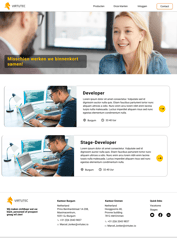
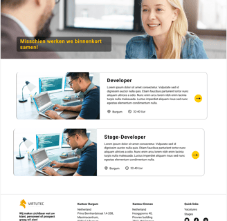
Virtutec Website
Virtutec is a technology company specializing in innovative software solutions for sales, production, and after-sales support. I redesigned the website to simplify navigation, align with our unified platform, and enhance the user experience
About Virtutec
Virtutec offers a comprehensive suite of software solutions to streamline various business processes. Their unified desktop app includes three core products, as well as an additional app dedicated to Virtutec itself
SalCon - This software is focused on sales and marketing. It enables users to present products realistically and interactively through virtual tours or 3D configurations. This helps both sales teams and customers visualize complex products, making the sales process faster and more transparent
ProCon - Designed for the production and assembly process, ProCon assists workers by guiding them step-by-step through tasks. It helps overcome labor shortages by providing a user-friendly interface, which reduces training time and enhances efficiency, even with foreign workers
SerCon - This after-sales software empowers customers, dealers, and service technicians to resolve issues independently. By providing access to up-to-date manuals, part catalogs, and 3D visualizations, it ensures quick, accurate service without overwhelming the service department.
Together, these tools help businesses streamline their operations across sales, production, and after-sales services, enabling improved efficiency and better customer experiences.
Project Overview
My Role:
As a UX/UI designer at Virtutec, I led the website redesign to address navigation challenges and improve user engagement. After thorough research, I implemented a user-friendly design system, enhanced UI consistency, and streamlined navigation for a seamless experience.
Goals:
Improve Navigation: Simplify the site's structure to ensure users can easily find relevant information.
Enhance User Engagement: Design an intuitive interface that keeps users interacting with the site longer.
Strengthen Brand Identity: Create a consistent and modern look that reinforces Virtutec’s innovative image.
Highlight Core Solutions: Clearly showcase SalCon, ProCon, and SerCon to emphasize their value to customers.
Redesign Process
Discover
Define
Develop
Deliver
Heuristic Evaluation
Competitive Analysis
Persona
Site Map
Sketch
Wireframes
Usability Test
Final Wire Frames
High-fi prototypes
Discover
To understand the users' pain points and develop effective solutions, we employed a comprehensive research approach that consisted of the following methods:
Heuristic Evaluation
Competitive Analysis
Heuristic Evaluation
In this step, I reviewed the website to identify unnecessary data and focused on ensuring consistency throughout. I prioritized using only relevant information to help customers quickly access what they need. From a usability perspective, I evaluated navigation, clarity, consistency, and error prevention. Based on these insights, I enhanced the browsing experience, making it more intuitive and user-friendly.
Home Page
The image on the homepage is unclear and does not effectively convey the company's purpose. It includes an excessive amount of text, making it difficult for users to quickly understand what the company does. Additionally, the use of purple in the design does not align with our brand's color accents and lacks relevance to our company's identity. Overall, the homepage fails to communicate that the website is focused on technology, 3D modeling, and related solutions.
1
1
The website lacks a clear hierarchy, making it difficult for users to navigate and understand the content. It also lacks consistency in its design, failing to maintain a uniform typeface and layout across different sections. This inconsistency creates a disjointed user experience and reduces the overall professionalism of the website.
2
2
Products
The colors chosen for each product do not align with their respective identities, making it challenging for users to connect the visuals with the intended purpose of each product.
Additionally, although a YouTube video has been created for every product, these are currently positioned at the bottom of the page. To improve accessibility and user experience, these videos should be relocated to the top of the page, allowing users to easily view them without extensive scrolling. Moreover, the absence of essential buttons for contacting us or requesting a demo is a significant oversight, as these are crucial for driving user engagement and conversions.
1
1
The website contains an excessive amount of text, which can overwhelm and bore users. This issue is compounded by the lack of engaging visuals or clear key points that quickly communicate the value of our software. To address this, we need to streamline the content, focus on concise and impactful messaging, and incorporate compelling visuals that highlight the key benefits of choosing our software.
This will make the website more engaging and help users understand why our solutions are the right choice.
2
2
Competitive Analysis
In the early stages, I began by examining other technology websites with similar objectives. We conducted an in-depth analysis of these websites to better understand their overall layout and key features. From this research, we identified effective ways to structure our navigation bar, focusing on categories such as:
Products: Highlighting how our products can help, showcasing customer success stories, and providing options to request a free trial or demo.
Value Proposition: Emphasizing our unique selling points, such as the ability for users to engage with our products using VR glasses for a more immersive experience.
Define
Persona
Based on our research and discussions with the business team to understand their goals and needs, I developed this persona.


Site Map
The information architecture we developed was based on our research and the data that we collected from users.
Develop
Sketches & low fidelity wire frames


Our goal in creating the initial wireframes in Figma (mid-fidelity) and hand-drawn sketches (low-fidelity) was to conduct user testing to evaluate users' ability to navigate the categories and easily find the desired services. Throughout the process, we made several changes to enhance user performance and improve their overall experience.
Deliver
Usability Test
To evaluate the effectiveness of our website's design, I conducted usability testing with new users who were unfamiliar with the platform. The test revealed that users could smoothly navigate and complete their tasks without major difficulties. However, they expressed a desire for more detailed and clearer information about our products.
In response to this feedback, we made the following improvements:
Enhanced the homepage by including more product-focused content, supported by visuals to make the information easier to understand.
Added demo and free trial options on every slide of the homepage, ensuring easy access for users—a feature that was less prominent in the initial design.
These updates provided users with a clearer understanding of our offerings and significantly improved their overall experience.
High Fidelity wireframes


Homepage
Salcon
Procon


Sercon
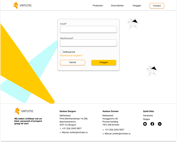
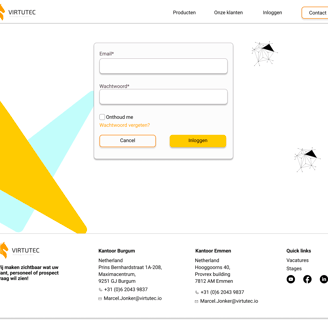
Login
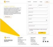
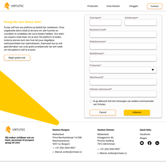
Request demo
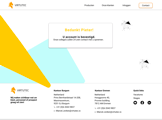
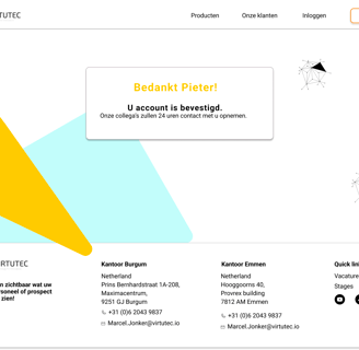
Confirmation demo
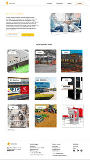
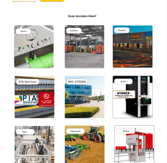
Our customer
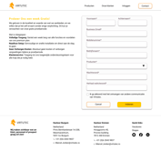
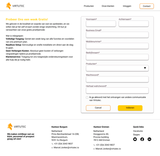
Request free trial


Confirmation free
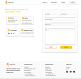
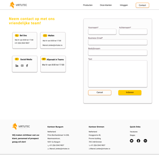
Contact us
